Maybe pick you fav and tell me what mood/atmosphere they show to you? A few colour and lighting experiments i’m doing while i work on a tutorial for simple shading, knowing what you think might help me improve it! These are all using the same base colours and the same technique but in different ways, i’ll cover that in the tutorial.
I stopped the coloring of the shirt
here cause I guess you get the basic idea. If you wanna see more of the
coloring and the brush I use you can look HERE! Also you can see how not just folds but shading can define a form HERE!
I hope this helps! I’m so bad with words and explaining things (/)//(/)
okay so my other post has gotten circled around from hell and back , but now I just want a better, cleaner version to get a chance to get around so HERE YA GO
hey yall its me the Art Mom™ to help you shade pretty
rule 1: DO NOT SHADE WITH BLACK. EVER. IT NEVER LOOKS GOOD.
red– shade with a slightly darker shade of purple
orange– slightly darker and more saturated shade of red
yellow– i think like..a peach could work but make it a really light peach
green– shade with darker and less saturated shade of blue or teal
blue– shade with purple
purple– a shade thats darker than the purple you’re using and maybe a little pink (MAYBE blue)
pink– darker shade of red
white– a really light lavender or blue..or i guess any really light colour??
black– okay listen dont use pure black to colour anything unless you want to leave it with flat colours because you cant really shade black lol
grey– a slightly darker shade of purple or blue (less saturated)
brown– slightly darker and less saturated shade of purple or red
aaaaand thats all i got lol. let me know if there is anything i should add to this list!!
If you’re a visual learner…
I made some Balls of Colour to go with Art Mom™’s post:
A small tip for blacks, don’t use white and make it darker. Pay attention to the tone you would like. For example, for something sad? Start with blue and desaturate it and you can shade from there. With this method you also can end up with something darker and richer than actual black. Believe it or not, white is the same way.
Personally, because of my taste, all my blacks are based off a red, purple, or green.
one thing thats nice about crossing arms is u can use it to hide hands (sneaky laugh)
heres a transparent view of how the arms cross and the basic way the weight in the arms reacts to crossing (it will bunch at the elbow and flatten at the crossing
heres how they might work with titties (don’t listen to that last one, i do it all the time, but the boobs will sit on top of the arms so they will flatten out as the weight settles across the plane of the 2 arms, not just hang)
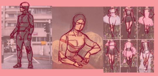
A bit of expression notes, use crossed arms mostly if the character is putting their attention or needs inward, such as thinking or being cocky or scared. moving the elbows further out or upward and having the arms low is a more confident or angry expression, while having the arms high up, more near the arm pits, and the elbows close to the body, is a more scared expression, usually the hands are visibly clasping the arms. now this isnt 100% always the same meaning, like having the hands up and elbows close could be a more shy or i cant keep in all this love expression, but thats the basics.
Crossing legs has another advantage as well because you can usually hide a thigh at most angles, as u will usually see only one leg.
i dont have a good one from the side, sorry. One thing to note is when the legs are crossed it will effect the fat on the thighs, and the will be flattened by each other depending on the contact, but like before, you can kind of hide it if you get good at using it to hide a thigh lol
as for proportions, if its not too cartoony you can usually follow the 8 head rule where you divide the body into 8 pieces, each the length of the head
so you can figure out what the length would be in heads, like if you’re doing the calf for crossed legs, that would be 2 heads, and you can just measure that from your original character’s head. you can even experience with different types of proportion, like 4/3 heads for more cartoony characters. note that this won’t be as easy to figure out if you’re using dramatic perspectives unless you can account for that.
You can try to figure out how the length would work with the change in perspective by keeping tract of the head lengths and how they would change with the perspective like this
Hello friends, this is the long awaited tutorial on Line-Quality, Art-Style, and Same-Face-Syndrome.
Line-Quality is improved by building Muscle-Memory.
You build muscle memory through Drawing-Exercises.
Art-Style is developed over time through Observation and Routine.
Routines such as… Drawing-Exercises.
And now for… the Ultimate Drawing-Exercise-Routine!
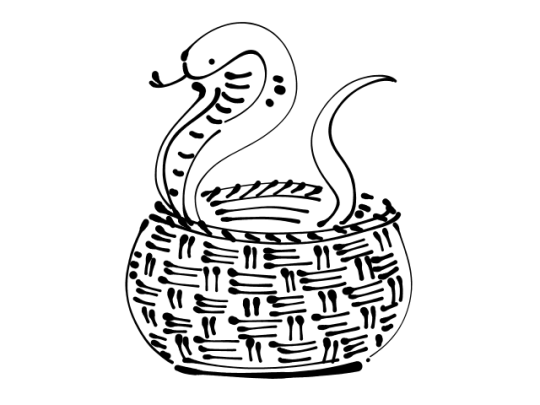
It’s called Snake-In-A-Basket!!
Draw any kind of snake inside of any kind of basket. You have 5 to 20 minutes to complete it before each/every Big-Serious-Illustration to tackle. No more, no less time!
Draw it… NOW!
(my example that I drew in GIMP)
Art-Style is not necessarily what you think it is. A fairly common style issue discussed in artist circles is the inability to draw the same character twice while retaining their likeness or the lack of uniqueness which makes our art (recognizable) distinguishable from another’s “oh! YOU drew this!”.
Here are the fastest pathways to attaining the elusive Art-Style:
Repetition!!!!!
Recurrence-of-Thematic-Elements (everyone is sad, robots, someone is always shirtless, etc)
Same Color-Palette used for everything you draw
Same-Tools (line width, brush set, same paper, canvas size)
or Same-Program
(examples of palettes!! you can’t go wrong with having a rainbow)
Some Amount of Explanation:
If you draw on the same size or same scale (A6, A5, A4, A3 | B6, B5 | Letter) or in the same orientation (Landscape or Portrait), it helps you learn Composition intuitively by training you to make use of the space you have. Also it’s easier to print out and frame if you draw on common photo print sizes 4×6, 8×10, etc.
Even if you make a lot of use of Blend/Blur and you’re more of a Painter than a Cel-Shader– deciding to use a Set Personal-Default-Color-Palette instead of randomly choosing them on the Wheel/Triangle-Thing will still give you enough stable consistency.
Onto the next thing!
Same-Face-Syndrome is normally caused by one of two things. If it’s not one then it’s the other: Same Shapes or Same Details.
To make noticebly different characters you have to Exaggerate.
Before you try your hand at drawing any Face or Body Type, draw another Snake-In-A-Basket first.
You think I’m joking?
No. I’m not.
So to wrap up, you need to Warm Up to draw, you need to make a color palette and stick to it –or just use the same Crayola pencils, or the same kind of Bic pen, same kind of sharpie, .7 or .5, and have themes like “plaid flannels for everybody” or “hoodies and jeans”. Find those things you can execute consistently, like hatching or stippling, and if you like it, stick with it!
Hope this helps!
Now draw a SNAKE-IN-A-BASKET!
Why the snake in a basket though?
This is the alternative looks a bit more abstract. The Snake-In-A-Basket makes use of different lines going in different directions but in one visually comprehensive Object. Its purpose is to build confidence in making long, medium, short lines.
if you feel like you can’t draw for shit but still Want to Practice, just draw over random shit
practice anatomy without having to work too hard
also 10×1
this is a huge part of art development!! so many people are afraid of being accused of “tracing” even in their unpublished practice that they never ever do it. DO IT, just don’t claim it as your own or post it if you’re uncomfortable?? Getting the hang of anatomy is so much easier when you trace at the start, and then move on to using reference images. Once you trace a hand enough times, you understand how it’s supposed to curve or bend or flex in the reference photos. I have like 4 folders full of anatomy studies that I’ve done by tracing, and it helps a ton with getting out of same body type/same face syndrome!!